
Trillium - Trace Hudson ©
On this installment of How To Make Better Prints, I will address a commonly overlooked tool we photographers and artists have at our disposal: The Histogram.
I would say that after image resolution, the Histogram is our second most important tool and we need to take full advantage of it.
“You don't take a photograph, you make it.”
― Ansel Adams
First, a little bit of history. The word “histogram” was first used by the English mathematician Karl Pearson in 1891 and was coined with the intention of linking two words together, “historical” and “diagram”. At its very core, the histogram is a simple graph used to display historical data in the form of bars called bins. Each bin displays how many values represent one particular range. In photography, the histogram’s bins help us visualize the quantity of pixels per color tone available in an image/photograph from black (left) to white (right). Gaps in the histogram represent the absence of values in that specific tonal range.

Ok, so why is it that it’s so important? It’s because we cannot trust our eyes. Our eye/brain combination is trained to make color assumptions based on what we see, so when looking at an image we can only tell colors - or for that matter, shades of gray - apart because we can compare them with one another. What this means is that when we look at our photos through our screen and we spot the darkest point our brain assumes it is black, and that the lightest/whitest part of the image is white.
We cannot place all the blame on our brains. Another key factor that furthers this problem is that when we look at an image on our monitor, tablet or mobile device we are looking at translucent light. Our images literally are being pushed out of our screens by tiny light emitting cells. On the flip side, when looking at our photo prints we see reflected light. Reflected light has a lower intensity than its translucent counterpart making the images we see on screen perform differently when printed on paper.
Now that we know how our eyes see and what the histogram shows, we should be asking ourselves where does this all fit in with our workflow. The answer to this is simple, at the end.
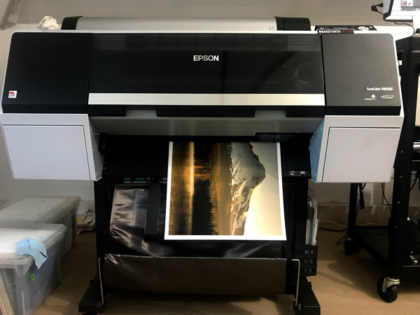
Everything you are doing today, from capturing your image to editing it with Lightroom, Photoshop, Snapseed or your favorite image editing app is great! You should not change any bit of it, but since you want to print your photos you’ll want to add a last step to your workflow:
Histogram Evaluation
Do you want to know why Ansel Adam’s images were so great? I mean, yes they are perfectly composed, and balanced, but most of us can make well composed and balanced photographs *for screen*. So, what was his secret? He spent hours dodging and burning, printing and reprinting his photographs until he achieved what he called ‘the performance’. But Ansel did not have at his disposal this wonderful tool we’ve been talking about. He had to work very hard to capture the wide variety of tones available on his prints. Thanks to Mr. Pearson and the wonders of technology, we don’t have to work as hard as he did.
“Dodging and burning are steps to take care of mistakes God made in establishing tonal relationships...”
― Ansel Adams
Let’s say you want to make a photo print of the photograph you took while traveling through Oregon over the summer. You’ve done your fair share of editing and the people you have shared the image with have praised it. It’s perfect *for screen*. But before you send this image to your printer we want you to look at your histogram and answer the two simple questions:
- Does my photograph or digital image have a true black?
- Does my photograph or digital image have a true white?
Just by looking at the image we will not know, because of the reasons laid out above… Our eyes will take the darkest and lightest areas of the image and use them to make sense of the rest of the colors, tones and hues in the image. If there is no true black or white we effectively compress the tonal range in the image. On the screen we compensate sometimes by increasing our brightness and contrast, but on paper there is nothing we can do.
The negative is comparable to the composer's score and the print to its performance. Each performance differs in subtle ways.
― Ansel Adams
This leads us back to the histogram. Remember this step is exclusive for print, so you may think your edit changed, but this is only because you are increasing the dynamic range of your image by compensating for the brightness on your display.
The first thing we want to do is create a copy of the edited image then start to make for-print adjustments. Clip the blacks just a bit. Enough that you know they are there (looking at the histogram) but not so far that you lose important details in the shadows. Same thing goes with the whites. We want to clip them a bit, stop just before blowing out important highlights. After this initial adjustment you’ll notice that your colors become a bit more vibrant and contrasty. Finally time to soft proof using your printer/paper ICC profile for color calibration and print!